Showing posts with label Cover design. Show all posts

Friday, 25 April 2014

Thinking about your cover

The cover of many self-published books lack professionalism and as a result it gives a poor first impression of what may be a great book.

During our ‘Bookcamp’ self-publishing training course we take a detailed look at how to create a cover and what to consider in making it look as professional as possible. We would like as many of you as possible to produce your cover yourself, but many of the people who responded to our survey said that they would like someone else to do the actual physical work. This is either due to constraints of time or the learning how to use the software required seems to be too daunting. As a result, we are launching our ‘Picturebucket’ as part of Indie Authors Scotland’s new ‘Pick ‘n’ Mix’ publishing services. (You’ll have to pop over to the website when you’ve finished reading this to see why it’s called the Picturebucket.)

What we want you to understand is that it doesn’t matter if you aren’t creating the cover yourself, it’s still your book and you should lead the process. There are certain things you can do that will help us produce the perfect cover that reflects the ‘story’ of your book.

Images

The best way is to find an initial image that you believe begins to tell your story. There are many stock photo sites on the web that offer a full range of pictures that you might consider. Before you search for the image, do a little preparation by thinking of keywords that you can use to narrow the parameters and gives you less pictures to choose from. If you can’t find the image yourself, make sure you supply us or your graphic designer with those keywords, it will be of huge benefit to both parties.

Fonts

You may not realise how important typefaces are in telling a story. The font you choose for the cover of an historical novel will be completely different to the one you would choose for a business book. Have a look at books in your genre in a bookshop. Pay close attention to the shape of the typeface on the cover and choose two or three that you like. If you give that information to the designer, it will help to identify the kind of look you need.

Blurb

A short synopsis of your book will help any designer understand the themes of your book and will help them. It's also good practice for you to prepare your blurb to help you to sell it.

Indie Authors Scotland is all about you as the author taking control of your work. These simple tips will help any designer you are working with to produce a professional cover that begins to tell your story. Of course, we hope you choose us to help you.


To learn more about our new publishing services and ourtraining pop over to Indie Authors Scotland’s website.

Have a great week.
Sinclair

Friday, 14 February 2014

Using symbols in Photoshop to create your cover -Part 3

The final part of my short guide to using shapes and brushes to create a cover for your book.

Part 3 - Using custom brushes

Thanks again to the artists of the deviantart.com community for the brushes and custom shapes used in this series of videos

Friday, 27 December 2013

The ever-changing face of book covers - Part 2

I hope you had a wonderful Christmas and that Santa was good to you.

Last week I charted the changes in design and taste in book covers by looking at how the dust jacket of Raymond Chandler’s ‘The Big Sleep’ evolved and reflected the contemporary ideas down through the years. I took you from the pulp magazine classic of the early forties through to the abstract covers of the seventies.
Today I bring the story up to date and look at how modern designers are putting their own spin on one of the great crime novels of all time.

Early 1980s

During the early part of the eighties the covers became flat and rather boring. I couldn’t even find a copy of The Big Sleep online from this period but as you can see from this image of ‘Playback’ the style was vey simple. A single photograph with the text tucked away in a corner. I can't be sure but I get the impression that the publishers weren’t trying too hard and that Chandler’s work had fallen out of fashion. 


Late 1980’s/Early 1990’s

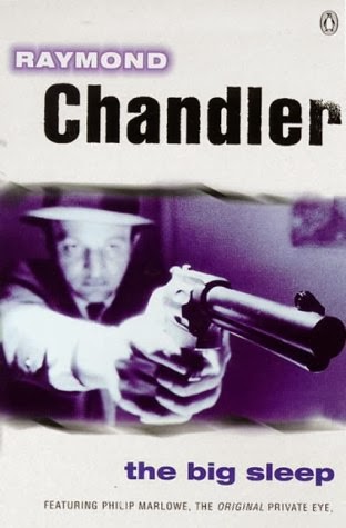
By the late eighties there was a major shift in the design of the book covers and this version looks very different from anything that had preceded it. There is something very cinematic about this cover. There is more white on the page than you would expect for a crime novel but it works as it emphasises and draws the eye to the photograph, which itself looks a like still from a movie. The photograph is very generic and could apply to any crime novel of that period but that doesn’t detract from its effectiveness.


21st Century

There has been another dramatic change to the design philosophy with the bold colours and very modern typeface of the current paperback covers. These are very simple designs using a single illustration and the quirky positioning of the text to create a striking look. This version screams at you from the bookshelf and despite being very modern it still harks back to the period the books were written; I feel it is the perfect 21st Century interpretation of a pulp cover.


The future

Penguin recently ran a competition for a new design for ‘The Big Sleep’ jacket. My favourite entry is this fantastic cover by Jason Hibbs. Jason has caught the essence of the book with a modern illustration that is complemented by the clean, classic pre-war typeface. The illustration gives you a window into one of the most important parts of the story, where Marlowe discovers how Carmen Sternwood is being blackmailed. It is also one of the great iconic scenes in the Bogart movie and the greyscale image only helps to highlight the connection to the film. Although Jason didn’t win the competition, I think he has shown that Chandler’s greatest work is in good hands and that modern illustrators and designers will continue to be inspired to produce covers that are true to their subject matter while remaining contemporary to the times they are created.
Jason was kind enough to allow me to use the image. If you like this illustration pop over to Jason’s website to see more of his work and give him a compliment or two.


I’ll revisit the important subject of cover design in future blogs. I hope I have given you something to think about in terms of what kind of cover you would like for your books and how it should begin to tell your story. Check out our ‘How to self publish’ courses at Indie Authors Scotland for more information on our Cover Design course.

Friday, 20 December 2013

The ever-changing face of book covers - Part 1

During our Indie Authors Scotland ‘How To Self Publish’ courses we stress the importance of cover design and how it influences a potential reader's perception of a book.
One of the areas we consider is making both the typeface and the image relevant to the setting of the book. However, a cover is not only a reflection of its contents, it is also a reflection of the time it was created.
Over this post and next week's Friday post I am going to look at the evolution of cover layout over the past 75 years by showing you a variety of designs from different eras. The book I have chosen is one I know very well and is the perfect example of how a book cover evolves to suit contemporary tastes.
The Big Sleep by Raymond Chandler was first published in 1939 and is firmly rooted in that period. So how has the look of its cover changed to stay true to the original story while reflecting the changes in taste?

1930’s/40’s


The book is a re-working of a number of short stories first published in ‘The Black Mask’ magazine. That publication fitted into the category of’ Pulp Fiction’: cheap and often shocking fiction designed for the mass market.  This cover reflects that heritage perfectly with the shocking sight of a man in the bedroom of a naked woman who wasn’t his wife, who is the image of a femme fatale as she protects her dignity with a gun. It would have been enough to titillate and thrill potential readers who would have immediately understood that there was a mix of sex and violence within the pages.


1950’s

This cover I believe is from the fifties or early sixties. The colours and fonts hint at that time frame. The image combines details from various points in the story to great effect and is quite striking. The use of the skull is an obvious icon of death and the orchids hint at the fragile beauty of Carmen Sternwood, the woman who is being blackmailed in the book. It also indicates the scene in the Sternwood's greenhouse where Marlowe is persuaded by Carmen's father to take the case. The cover is playing a key role in attracting the reader while staying true to the trends in design at the time it was created.


1960’s/70’s

The art and music of the late sixties and early seventies became more avant garde, books and films were more violent and these covers show those influences on cover design. The green cover has a illustration of a man who wouldn’t have looked out of place in a Spaghetti Western rather than showing the urbane, witty private eye that is Philip Marlowe. The other two designs are so abstract they could just as easily have been books on philosophy or art theory rather than a crime novel. No attempt has been made to communicate the contents of the book to the reader, it seems like the designer has replaced the writer as the most important contributor to the book - Chandler's name doesn't even appear on the bottom two. This is all to the detriment of using the cover to start to tell a story. Personally, I really don't like these covers and they would not have inspired me to buy these books at the time.


Next week I will have a look at how modern designers are taking on the challenge of producing something fresh and original that reflects both the story of the novel and contemporary trends in cover design.
You can learn more about our Cover Design training course at Indie Authors Scotland.