
I hope you had a wonderful Christmas and that Santa was good
to you.
Last week I charted the changes in design and taste in book
covers by looking at how the dust jacket of Raymond Chandler’s ‘The Big Sleep’ evolved and reflected the
contemporary ideas down through the years. I took you from the pulp magazine classic
of the early forties through to the abstract covers of the seventies.
Today I bring the story up to date and look at how modern
designers are putting their own spin on one of the great crime novels of all
time.
Early 1980s
During the early part of the eighties the covers became flat
and rather boring. I couldn’t even find a copy of The Big Sleep online from
this period but as you can see from this image of ‘Playback’ the style was vey
simple. A single photograph with the text tucked
away in a corner. I can't be sure but I get the impression that the publishers weren’t trying too hard and that
Chandler’s work had fallen out of fashion.

Late 1980’s/Early 1990’s
By the late eighties there was a major shift in the design
of the book covers and this version looks very different from anything that had
preceded it. There is something very cinematic about this cover. There is more
white on the page than you would expect for a crime novel but it works as it emphasises and
draws the eye to the photograph, which itself looks a like still from a movie.
The photograph is very generic and could apply to any crime novel of that
period but that doesn’t detract from its effectiveness.
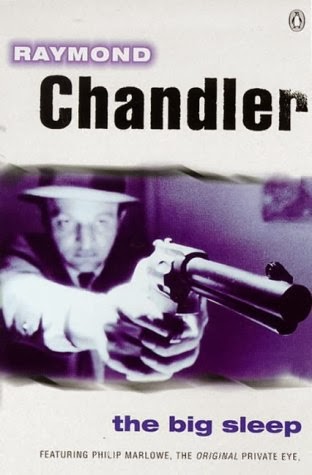
21st Century
There has been another dramatic change to the design philosophy
with the bold colours and very modern typeface of the current paperback covers.
These are very simple designs using a single illustration and the quirky positioning of the text to create a striking look. This version screams
at you from the bookshelf and despite being very modern it still harks back to
the period the books were written; I feel it is the perfect 21st Century interpretation of a pulp cover.

The future
Penguin recently ran a competition for a new design for ‘The
Big Sleep’ jacket. My favourite entry is this fantastic cover by Jason Hibbs. Jason
has caught the essence of the book with a modern illustration that is
complemented by the clean, classic pre-war typeface. The illustration gives you
a window into one of the most important parts of the story, where Marlowe
discovers how Carmen Sternwood is being blackmailed. It is also one of the
great iconic scenes in the Bogart movie and the greyscale image only helps to highlight the connection to the film. Although Jason didn’t win the
competition, I think he has shown that Chandler’s greatest work is in good
hands and that modern illustrators and designers will continue to be inspired
to produce covers that are true to their subject matter while remaining contemporary to the times they are created.
Jason was kind enough to allow me to use the image. If you like this illustration pop over to Jason’s website to see more of his work and give him a compliment or two.

No comments:
Post a Comment